CMU Admissions Website UX Redesign

A university’s admissions website should guide prospective students seamlessly, not create obstacles. At Central Michigan University, fragmented content and unclear navigation made it difficult for users to find essential information. As a UI/UX designer, I co-led a website overhaul to streamline navigation, refine content, and align the experience with student decision-making journeys. The result? Three new microsites designed around key user needs, each optimized for clarity, engagement, and conversion.
Deliverable
3 Microsites - Launched
Timeline
August 2023 – July 2024
Client
Central Michigan University
Roles
UI/UX Web Designer and Project Co-Lead
My Role
As a UI/UX Designer and Co-Lead Project Manager, I guided the Admissions website overhaul from concept to launch, managing project deadlines and ensuring consistent design standards. I created a detailed roadmap, led brainstorming sessions to refine the Information Architecture, adapted the navigation strategy, and designed pages to boost engagement. Partnering with writers, I shaped content that resonated with users while aligning stakeholders.
Project Goals
Improve the user experience for prospective students and counselors.
Ensure accessibility across the site for various audiences.
Implement UX principles for content layout and navigation redesign.
Build modular, scalable microsites for different user groups.
Discovery & Planning

Building a Collaborative Roadmap
This was the first project of its scale for my team and me, and we quickly learned that a strong process could make or break a project with so many moving parts. We started with four microsites but consolidated one after realizing it served the same audience and goals as another. Our roadmap was built through trial and error after the first microsite, incorporating UX best practices, stakeholder needs, and internal workflows. It balanced waterfall and agile methods, giving us structure while staying flexible enough to adapt as the project evolved.

Uncovering Insights Through a Content Audit
We conducted a comprehensive audit of the existing website to identify areas for improvement. This involved evaluating redundant or outdated content, analyzing SEO elements like meta descriptions, H1s, and URL structures, and reviewing digital assets such as images, videos, forms, and PDFs. The audit revealed several critical insights:
Internal Search Overload: Poor navigation forced users to rely heavily on search to locate key information.
Engagement Trends: Audience-specific pages like "Freshman How to Apply" performed significantly better, highlighting the importance of segmented content.
Low-Performing Pages: Pages with minimal traffic were flagged for consolidation or removal to streamline the information architecture.
Data-Driven Performance Analysis
Using Google Analytics, Looker Studio dashboards, and SEMrush, we analyzed performance metrics such as click-through rates, traffic, and user engagement. This data informed decisions on which content to prioritize, update, or remove, ensuring that the redesigned website would address user needs effectively.

Tools That Empowered the Process
The success of this phase relied on a carefully curated set of tools:
Content & Performance Analysis: Google Analytics, Looker Studio, SEMrush.
Planning & Mapping: Gloomaps and Slickplan to reimagine navigation and site structure.
Coordination & Collaboration: Wrike, Teams, Outlook, and Lucidspark for seamless communication and task management.
Research & Ideation

The Research & Ideation phase was dedicated to uncovering user needs, testing assumptions, and validating the new Information Architecture (IA). Through qualitative research, usability testing, and collaboration with subject matter experts (SMEs), this phase provided critical insights that informed every aspect of the redesign.
Understanding User Behavior Through Research
To build an IA that truly reflected user needs, we delved into trends across undergraduate, graduate, and international admissions. Post-pandemic, a notable shift emerged: undergraduate students prioritized financial stability over passion-driven career paths. This insight significantly influenced the organization of financial aid and admissions content, ensuring these concerns were addressed upfront in the new IA.
Revealing Pain Points with Usability Testing
Usability testing sessions with high school juniors exposed key challenges in the existing site. Participants were asked to complete tasks like locating scholarship information without relying on search—a method intended to surface navigation issues. The results were eye-opening: only 23% of tasks were successfully completed, highlighting severe wayfinding issues and a misalignment between the IA and user behavior. This feedback underscored the need for a major overhaul of the navigation system.
Research methodology at a glance:
Conducted moderated usability testing with 17 high school students
Used a semi-structured interview protocol to explore how participants navigate admissions content
Synthesized qualitative and quantitative data to inform IA redesign
Qualitative: Behavioral insights around how students search for and interpret admissions and scholarship info
Quantitative: Task completion rates, click-through patterns, and navigation flow analysis
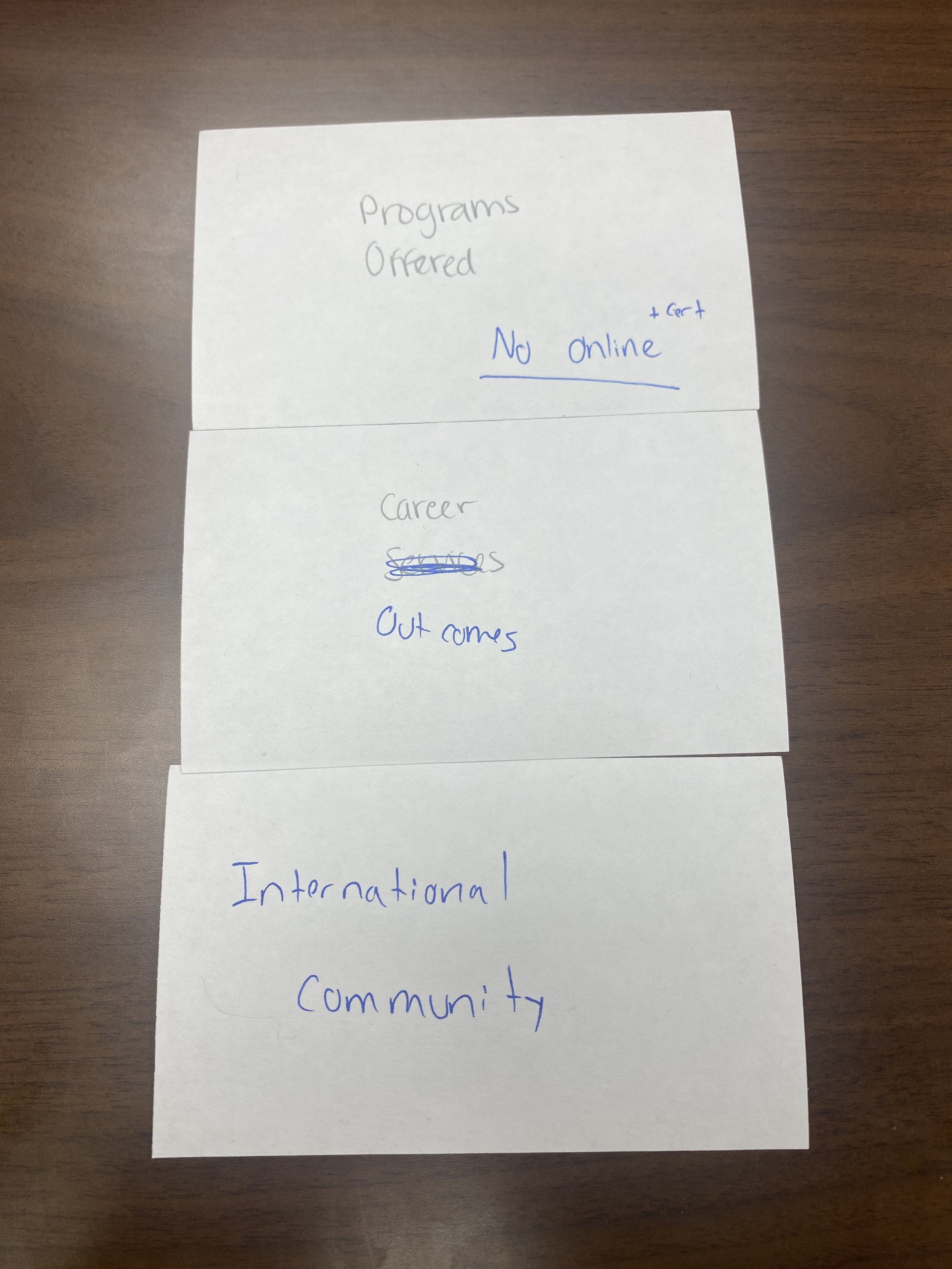
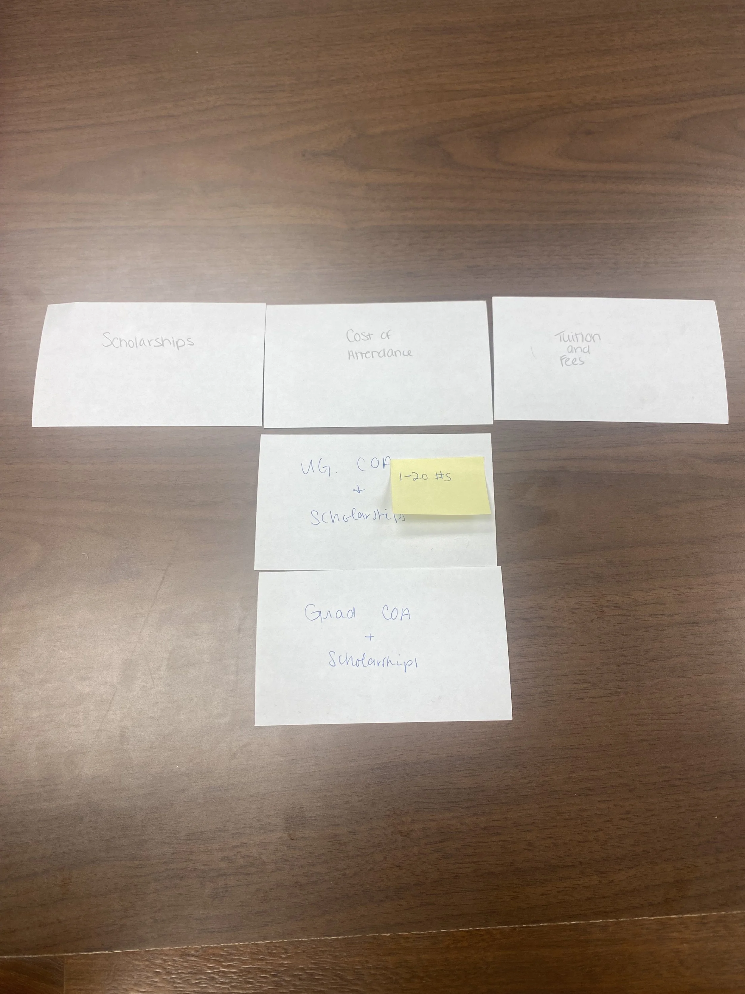
Validating Navigation Through Card Sorting
To refine the IA, we facilitated card sorting sessions with users and admissions SMEs. These exercises validated the proposed navigation structure and uncovered gaps that needed attention. Collaborating with SMEs allowed us to incorporate critical insights about student behavior, regulatory requirements, and admissions workflows into the IA. This partnership ensured the new structure aligned with both user expectations and institutional goals.

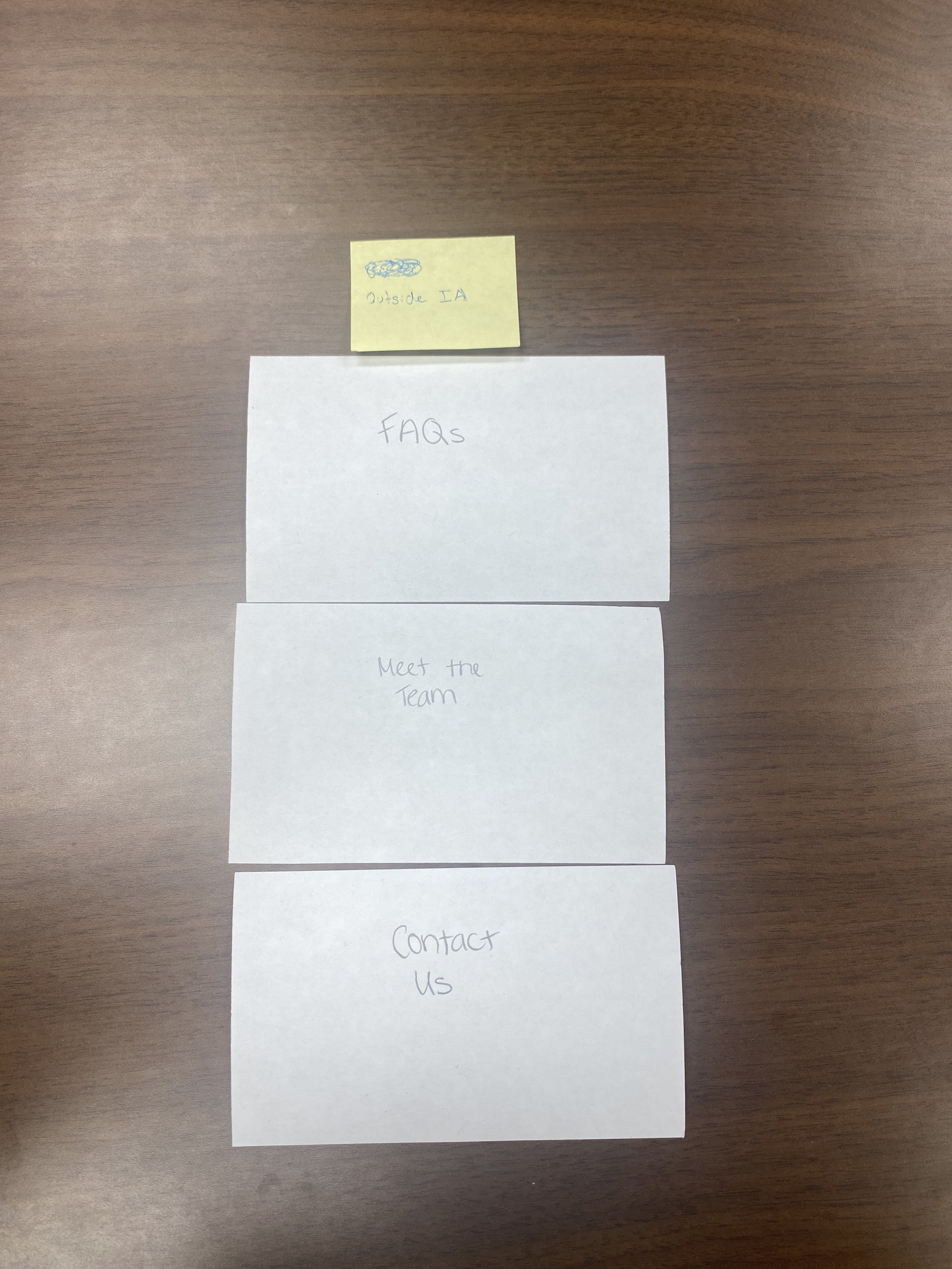
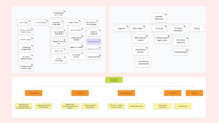
Building a Streamlined Sitemap
The iterative process of creating the sitemap was a cornerstone of this phase. Tools like Gloomaps and Slickplan helped us design a navigation system that prioritized user-centric content discoverability. The sitemap integrated clear calls-to-action, outlined page goals, and reflected the insights gained from testing and SME feedback. Each iteration was shaped by collaborative discussions with the admissions team, marketing strategists, web content experts, and recruiters, ensuring the final structure was both comprehensive and practical.

Design Implementation

Designing a mobile-first admissions website for a diverse audience required balancing creativity, functionality, and user-centered strategies. Every decision—from wireframing to multimedia integration—was driven by the goal of simplifying navigation, amplifying engagement, and fostering inclusivity.
Wireframing with a Mobile-First Focus
We began by wireframing 28+ key pages, using a mobile-first approach to ensure that every layout worked seamlessly on smaller screens before scaling to larger devices. The challenge was translating complex content into clear, digestible sections that would resonate with prospective students navigating the site on the go. These wireframes became the foundation for the broader design standards applied across all 58 pages, ensuring every element—from typography to spacing—aligned with the university’s brand and maintained visual consistency.
Dynamic Content with Flex Areas
Recognizing the need for dynamic and personalized content, we introduced Flex Areas on key pages. These zones allow admissions staff to update content quickly, ensuring messaging stays relevant to ongoing campaigns or user funnel stages. For example, prospective students exploring scholarship opportunities might see tailored calls-to-action guiding them to financial aid resources, all optimized for mobile navigation.
Visual Storytelling that Connects
Visual storytelling was another critical focus. We curated over 140 multimedia assets, including embedded virtual tours, campus imagery, and videos like Is CMU Walkable?. These assets were selected not only for their quality but also for their ability to help students imagine themselves on campus. Hero images and video content emphasized diversity, inclusivity, and vibrant campus life, creating an emotional connection with users from diverse backgrounds. Importantly, all visuals were optimized for mobile-first performance, ensuring fast load times without compromising quality.

Strategic Navigation and Conversion Optimization
Our design choices weren’t just about aesthetics—they were strategic. By cross-linking pages contextually, we guided users through a cohesive journey, making it easier for them to find the information they needed. Top-level pages were designed with conversion rate optimization in mind, placing critical links and navigation elements exactly where users expected them.
Development & Testing

Bringing the admissions website to life required careful attention to scalability, accessibility, and user experience. On the development site, we built custom templates tailored to the unique needs of the admissions team. These templates accommodated different page structures, such as those with or without left-hand navigation, ensuring flexibility for future updates while maintaining a consistent design language. The modular system allowed for seamless scalability, enabling the website to grow with the university’s evolving needs.
Resolving User Pain Points with Targeted Enhancements
We developed and implemented 22 targeted tasks to resolve these issues, from refining padding for better readability to improving responsiveness for mobile users. Each improvement directly contributed to creating a polished and user-friendly experience.
Thorough Testing
We conducted extensive sitewide testing to ensure functionality and a seamless user journey:
Verified links, buttons, and navigation components to prevent dead ends.
Tested redirects to ensure users reached updated pages smoothly.
Led quality assurance testing to ensure WCAG compliance for all microsites.
This thorough testing ensured the website delivered a consistent experience across all devices and browsers, meeting the diverse technological needs of its users. By prioritizing accessibility and inclusivity, the platform was designed to serve students of all abilities, aligning with the mission to provide equitable access to critical admissions information.