HealthRise Denials Navigator UX Redesign Overview
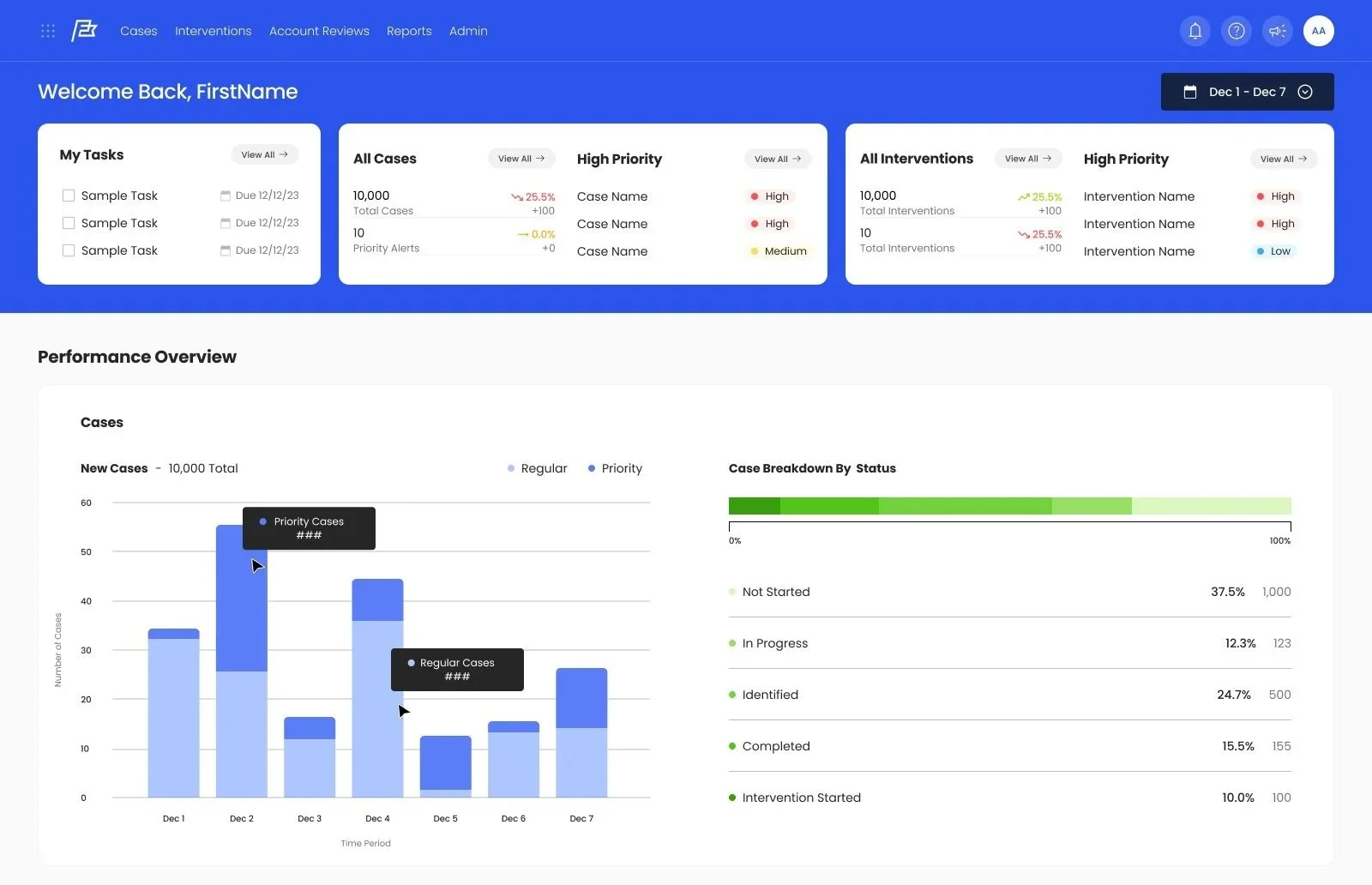
Role: UI/UX Research & Design
Duration: Sept 2025 - Dec 2025
Tools: Figma + AI Tools
Denials Navigator is HealthRise’s B2B SaaS platform for investigating medical claim denials and identifying their root causes. Our four-person team worked with HealthRise over one semester to redesign the dashboard, case list, individual case view, and intervention workflow.
We delivered a high-fidelity Figma prototype and design recommendations grounded in user research, workflow analysis, and usability testing.
My contributions
Conducted user interviews.
Wrote up the research synthesis.
Contributed extensively to affinity mapping and heuristic evaluation.
Redesigned the case list page.
Collaborated with the team on design decisions across all four workflows.
The Challenge
The UX Problem in Medical Claim Denial Management
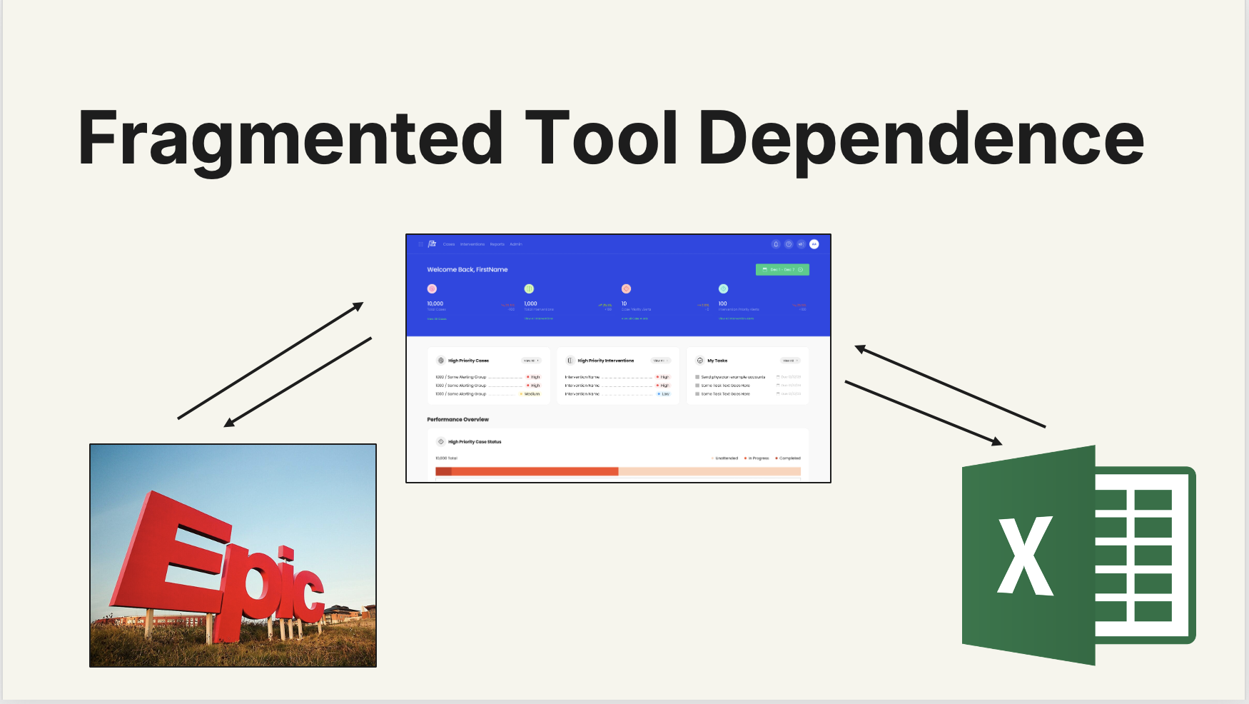
Denials Navigator helped analysts see where denial trends were emerging, but understanding and acting on those trends required more work. Users manually entered filters, repeated documentation, and moved between Navigator, Excel, and Epic to complete their investigations.
Important financial information was also difficult to find, even though analysts relied on denied dollars and recency to prioritize cases. We needed to make the platform easier to navigate and bring its interactions closer to how analysts already worked.
The Target Users
Primary Users
Denial management specialists
Review denied claims, identify root causes, and work cases daily.
Accounts receivable (A/R) follow-up staff
Handle claim follow-up, status checks, and resolution tasks.
Billing teams / billers
Prepare and submit claims, correct errors, and ensure clean claims go out.
Secondary Users
Revenue cycle managers and supervisors
Oversee team workloads, monitor trends, and make operational decisions.
Revenue cycle executives/leadership
Need visibility into denial drivers, financial impact, performance metrics, and long-term trends.
Connecting UX Research Findings to Design Decisions
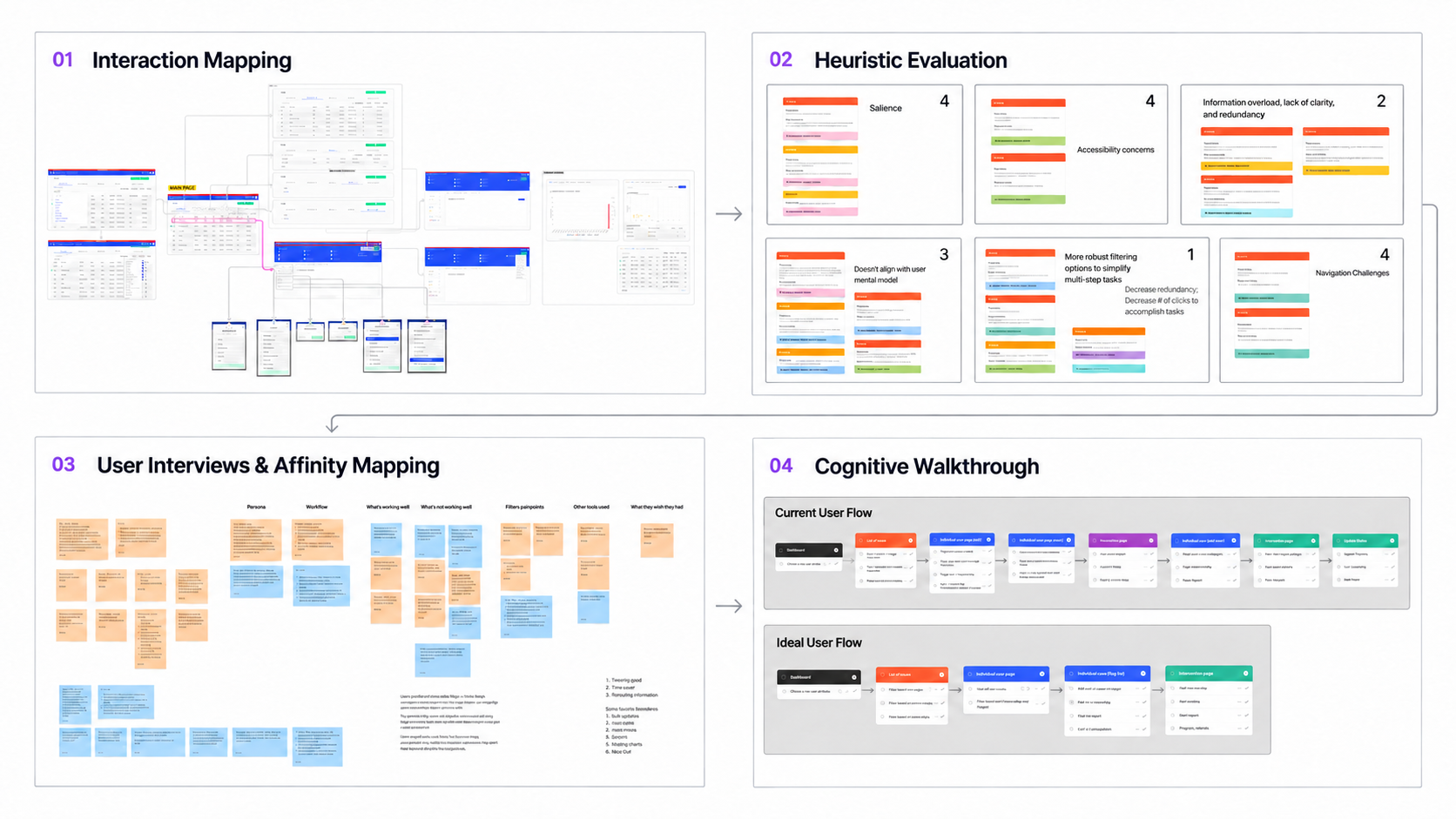
Our research included three user interviews, two moderated usability tests with users, stakeholder interviews, and client enhancement requests. We combined this evidence with affinity mapping, interaction mapping, heuristic evaluation, and cognitive walkthroughs. Two additional classroom tests informed refinement.
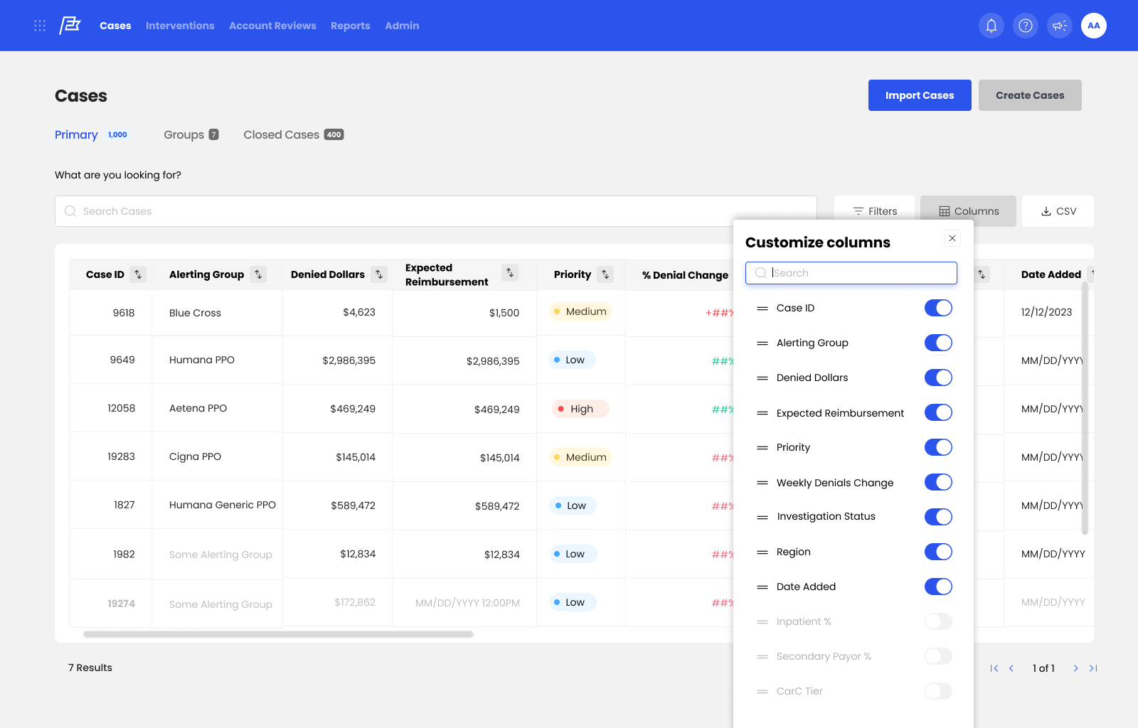
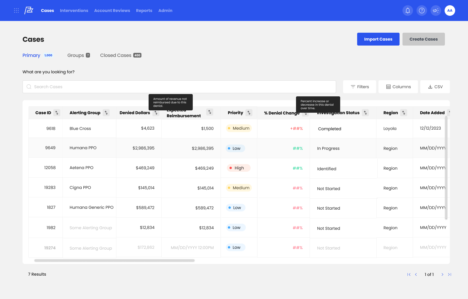
Manual filtering → Familiar, easier-to-use controls
Users described typing filter values as tedious and requested Excel-style filtering and more flexible sorting. Our evaluation found that filtering required at least five clicks.
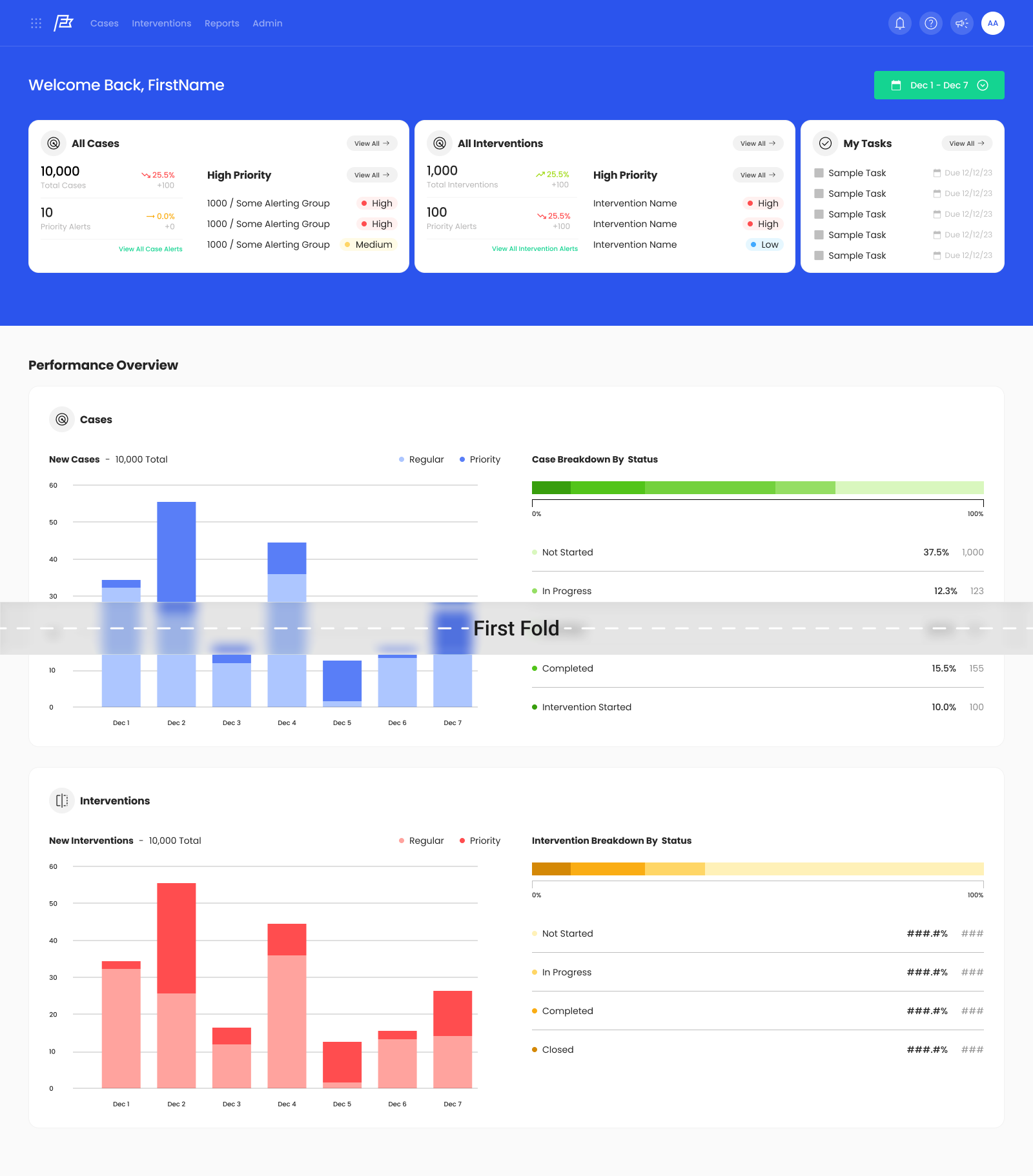
We consolidated filtering controls, reduced reliance on typed inputs, and renamed “Layout” to “Columns” to match familiar terminology.
Useful trends without clear next steps → Actionable dashboards
Charts helped users spot denial spikes, but those insights weren’t clearly connected to follow-up actions.
We moved tasks and high-priority alerts toward the top of the dashboard and designed chart interactions that lead directly to relevant filtered cases.
Fragmented investigation → Context kept together
Users exported data for deeper analysis and documented observations throughout their investigations.
We placed notes beside case visualizations and designed more flexible data exploration within the case view. We also recommended further investment in embedded analytics; replacing Excel was beyond the validated scope of this project.
UX Redesign Outcome and Usability Testing
We translated our research into a high-fidelity Figma prototype that connects case prioritization, investigation, and intervention in a clearer workflow. Across four core experiences, we simplified filtering and navigation, surfaced important case information, and added contextual guidance and progress indicators.
Our peer audit reinforced a central design challenge: reducing information overload while preserving the context users need to investigate denials. Participants found the dashboard more readable and case details easier to digest, while identifying opportunities for progressive disclosure and clearer interaction cues. We delivered the prototype alongside a formal design proposal and implementation recommendations, with priorities for further refinement grounded in that feedback